http://www.netmba.com/statistics/histogram/
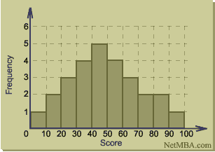
A histogram is a frequency distribution graph that shows a count of data points that fall into different ranges. In a histogram, groups (such as 0-9, etc.) are called 'bins' and are plotted on the x-axis, while the frequency is plotted on the y-axis. In this example, the exam scores of students are shown in a histogram with the data classes, or bins, covering intervals of 10, while the frequency counts the number of scores in each of those bins. For instance, there were 5 students with scores ranging from 40-50%.
No comments:
Post a Comment